Afrolicious:
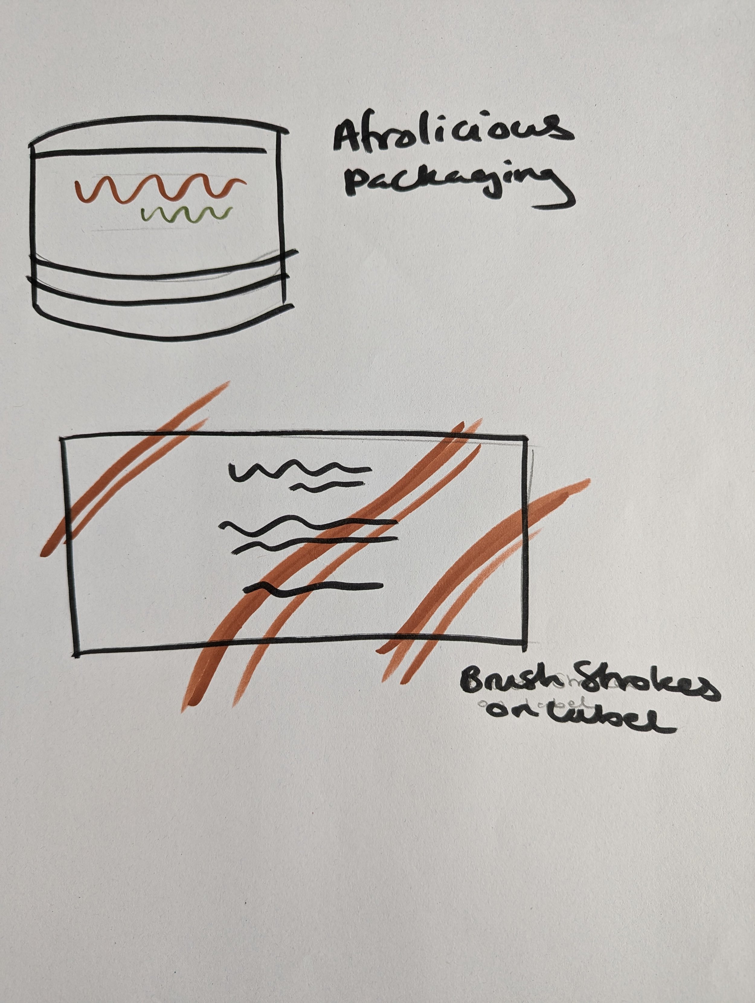
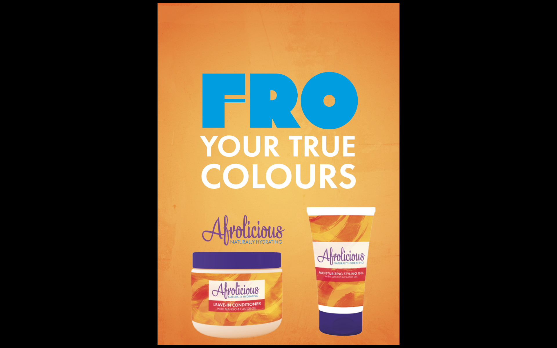
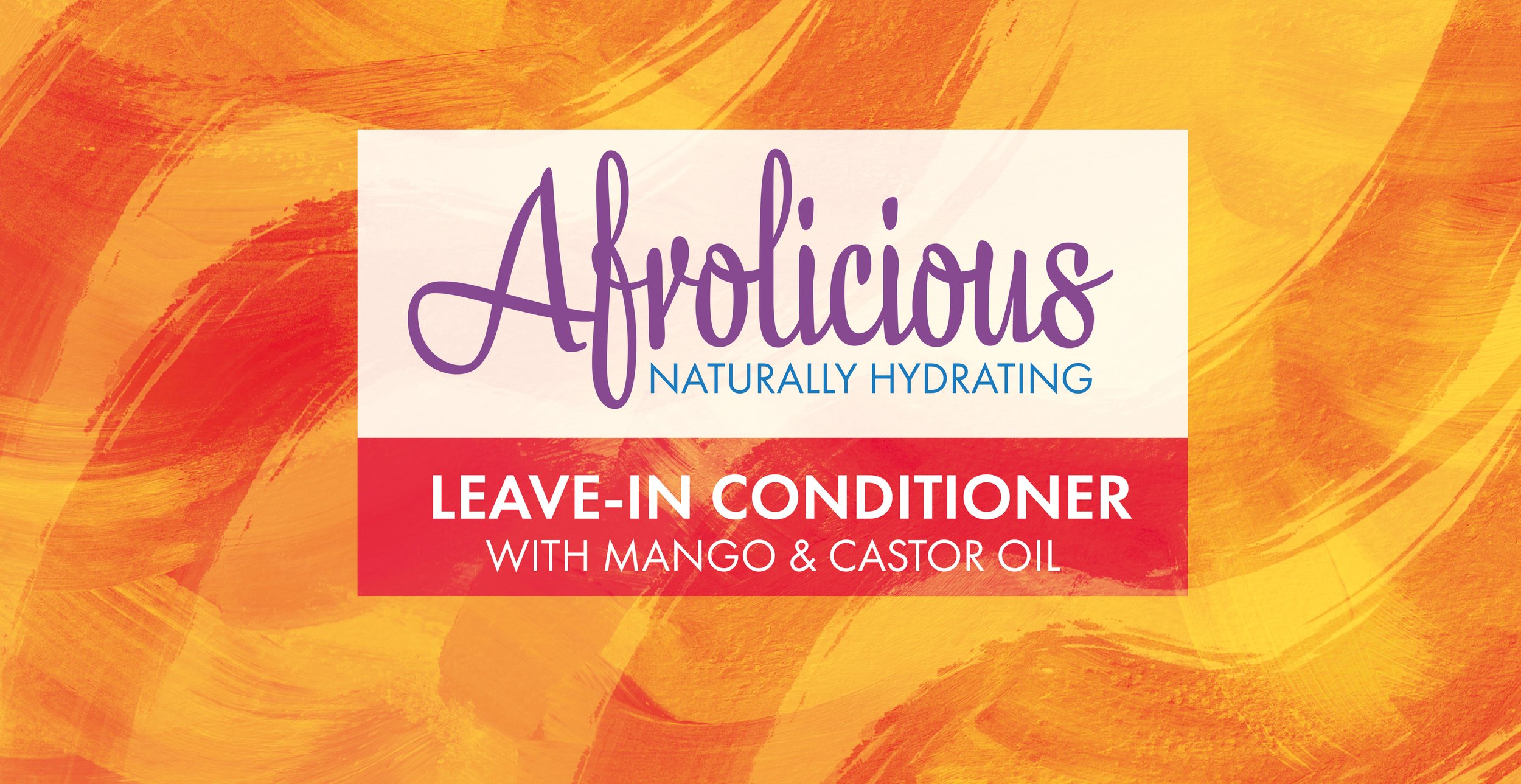
The packaging design for Afrolicious, a natural hair product, was thoughtfully crafted to embody texture and naturality. Brush strokes were utilized to showcase the natural texture and create a visually captivating experience. The color palette of yellows, oranges, and reds was deliberately chosen to evoke a vibrant and warm feeling, perfectly reflecting the essence of the product.
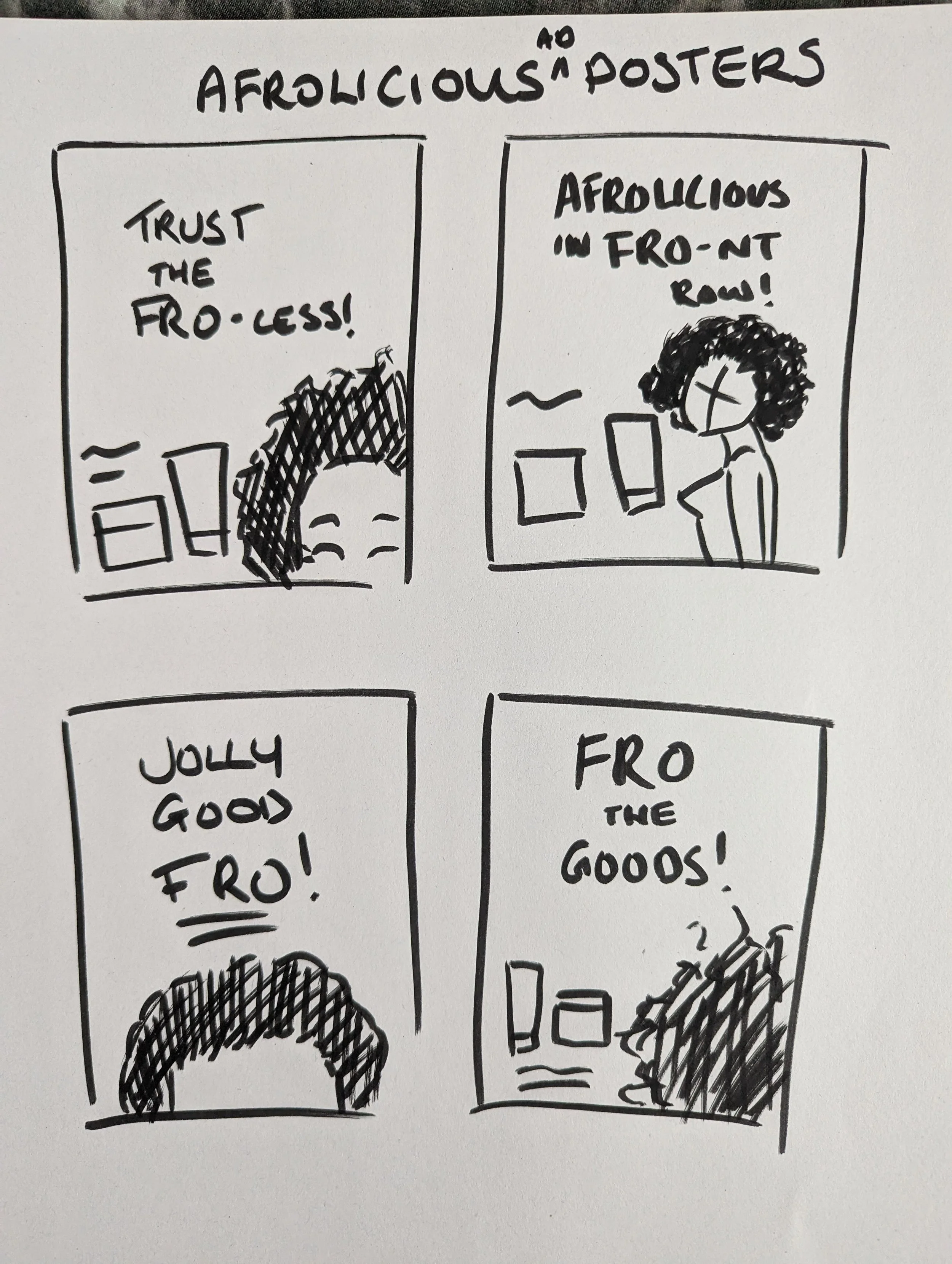
In addition to the packaging design, an engaging ad campaign was developed to highlight the unique qualities of Afrolicious. The campaign focused on incorporating words that either rhymed with or contained the word “fro” within catchy slogans. These slogans were transformed into simplistic yet impactful poster designs, where the emphasis was placed on the prominent use of “FRO.” By adhering to the vibrant color scheme of the product, the campaign maintained a cohesive visual identity that resonated with the Afrolicious brand.